The statistics are startling: over 70% of automotive shoppers now browse inventory, research vehicles, and compare prices on mobile devices. Yet many dealership websites still treat mobile as an afterthought, resulting in frustrated customers, high bounce rates, and lost sales opportunities. Mobile-first design isn't just a trend—it's a fundamental requirement for success in today's automotive market.
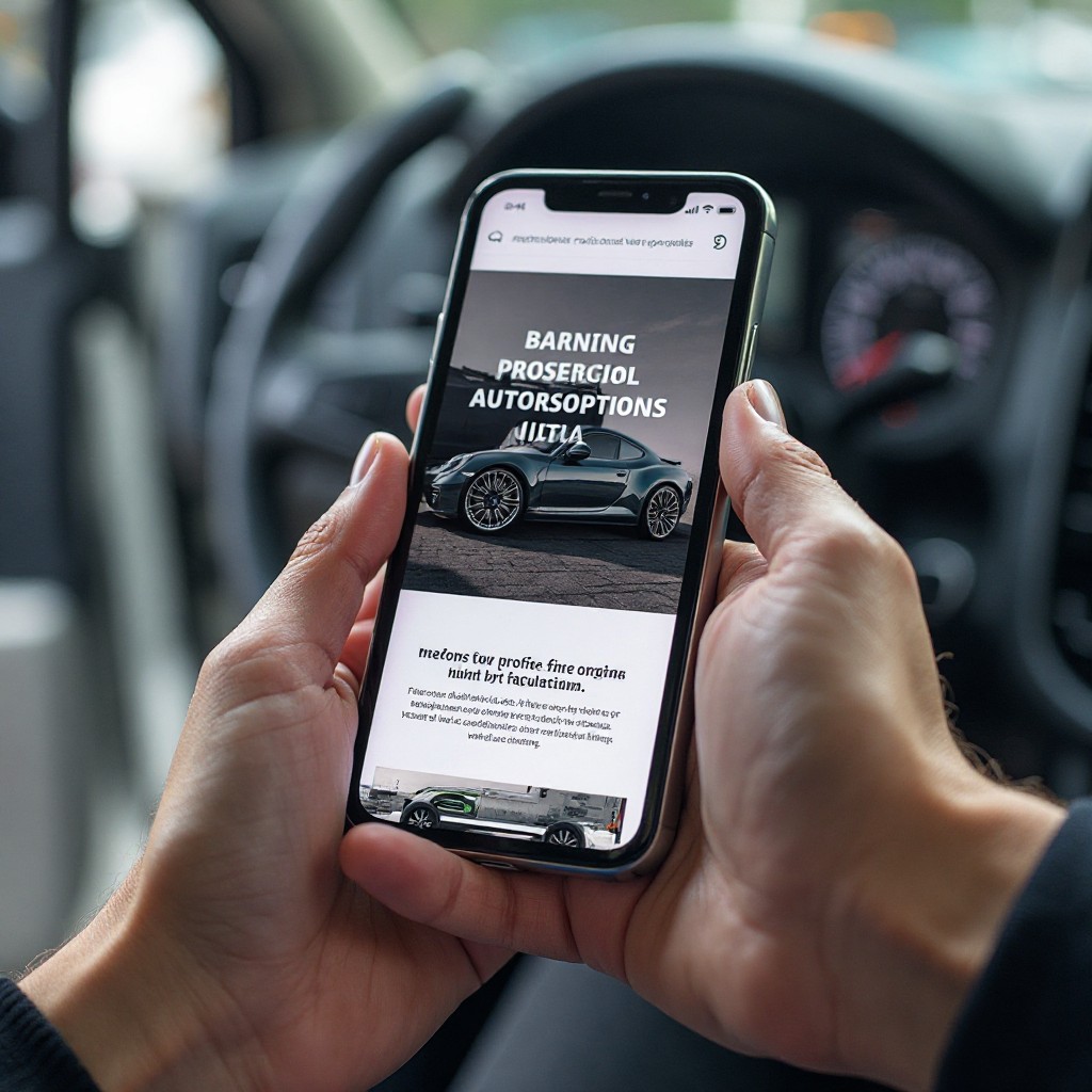
Understanding Mobile-First Design
Mobile-first design means building websites with mobile devices as the primary consideration from the very beginning. Instead of designing for desktop and then adapting for mobile, the process reverses: start with the mobile experience and enhance for larger screens. This approach ensures the mobile experience is optimized rather than compromised, prioritizes essential content and features, eliminates unnecessary elements that bloat pages, and improves performance across all devices.
The philosophy reflects how customers actually use your website. Mobile users often have different intent and context compared to desktop visitors—they might be shopping on their lunch break, comparing vehicles while at a competitor's lot, or looking up your hours while driving. Your mobile experience needs to accommodate these real-world scenarios.
The Business Case for Mobile-First
Beyond customer preference, there are compelling business reasons to prioritize mobile design. Google's mobile-first indexing means your mobile site directly impacts search rankings. Dealerships with poor mobile experiences are losing visibility in search results, while those with optimized mobile sites are capturing more organic traffic and qualified leads.
The conversion data is equally persuasive. Studies show that automotive websites with excellent mobile experiences convert at rates 2-3 times higher than those with poor mobile usability. When you consider that the average car purchase involves thousands of dollars in potential revenue, even small improvements in mobile conversion rates translate to significant financial impact.
Essential Elements of Mobile-First Automotive Websites
Successful mobile-first automotive websites share several key characteristics. Thumb-friendly navigation is crucial—buttons and links must be large enough to tap easily without zooming, typically at least 44x44 pixels. Navigation should be simplified with collapsible menus and clear hierarchy to avoid overwhelming small screens.
Loading speed is critical on mobile devices, often on cellular connections. Pages must load in under 2-3 seconds to avoid high bounce rates. This requires optimized images, efficient code, and strategic use of lazy loading. Every second of delay correlates with measurable drops in conversion rates.
Forms present a particular challenge on mobile. The best mobile-first implementations minimize required fields, use appropriate input types to trigger correct keyboards, implement auto-fill and auto-complete functionality, and provide clear, immediate validation feedback. A financing application that's easy to complete on mobile can be the difference between capturing a lead and losing a customer to a competitor.
Mobile-Specific Features
Beyond adapting desktop features, mobile-first design enables capabilities specific to mobile devices. One-tap calling and messaging eliminate friction in contacting your dealership. Location-based services can show nearby inventory, provide driving directions, or adjust content based on the user's location. Mobile wallets integration can streamline payment processes for service appointments and parts purchases.
Push notifications, when implemented with user permission, allow you to send timely updates about new matching inventory, service appointment reminders, or special promotions. The key is using these features judiciously to provide value without becoming intrusive.
Image and Media Optimization
Vehicle photos are crucial for automotive websites, but they can devastate mobile performance if not properly optimized. Modern mobile-first sites use responsive images that serve appropriate sizes based on screen resolution and viewport, progressive JPEGs that load incrementally, WebP format for better compression with quality, and lazy loading for below-fold images. Videos should be optimized for mobile bandwidth with adaptive bitrate streaming.
Testing and Continuous Improvement
Mobile-first design isn't a one-time project but an ongoing process. Test your site on real devices, not just simulators, across various screen sizes, operating systems, and connection speeds. Use analytics to identify mobile-specific issues like high exit rates on particular pages, form abandonment points, and features that aren't being used effectively.
Implement A/B testing to optimize button placement, form layouts, content hierarchy, and calls-to-action specifically for mobile users. Small refinements can yield significant improvements in mobile conversion rates over time.
Common Mobile Design Mistakes to Avoid
Many automotive websites make predictable mobile mistakes that harm user experience and conversions. Avoid requiring pinch-to-zoom to read text—font sizes should be at least 16px for body copy. Don't use hover effects that don't work on touch devices. Eliminate horizontal scrolling caused by fixed-width elements. Don't hide critical information in collapsed menus that users might never discover. And never use intrusive popups that cover content and are difficult to close on small screens.
The Future of Mobile Automotive Experiences
Mobile technology continues to evolve, and forward-thinking dealerships are already exploring emerging opportunities. Progressive Web Apps (PWAs) provide app-like experiences without requiring downloads. Voice search optimization accommodates the growing number of mobile users using voice commands. Augmented reality features let customers visualize vehicles in their driveway using their smartphone camera.
Implementing Mobile-First for Your Dealership
Transitioning to a mobile-first approach requires commitment but delivers measurable results. Start by auditing your current mobile experience from a customer's perspective. Use Google's Mobile-Friendly Test and PageSpeed Insights to identify technical issues. Gather feedback from actual mobile users about pain points and friction. Then prioritize improvements based on impact and feasibility.
The automotive industry has fundamentally shifted to mobile, and there's no going back. Dealerships that embrace mobile-first design are capturing more leads, converting at higher rates, and delivering better customer experiences. Those that don't risk becoming invisible to the majority of today's car shoppers. Is your dealership keeping pace with customer expectations?
Need a Mobile-First Website Redesign?
Our team specializes in creating high-converting mobile-first automotive websites. Let's transform your mobile experience.
Get Started Today